MINI-CASE STUDY
Mini-study: Trippy
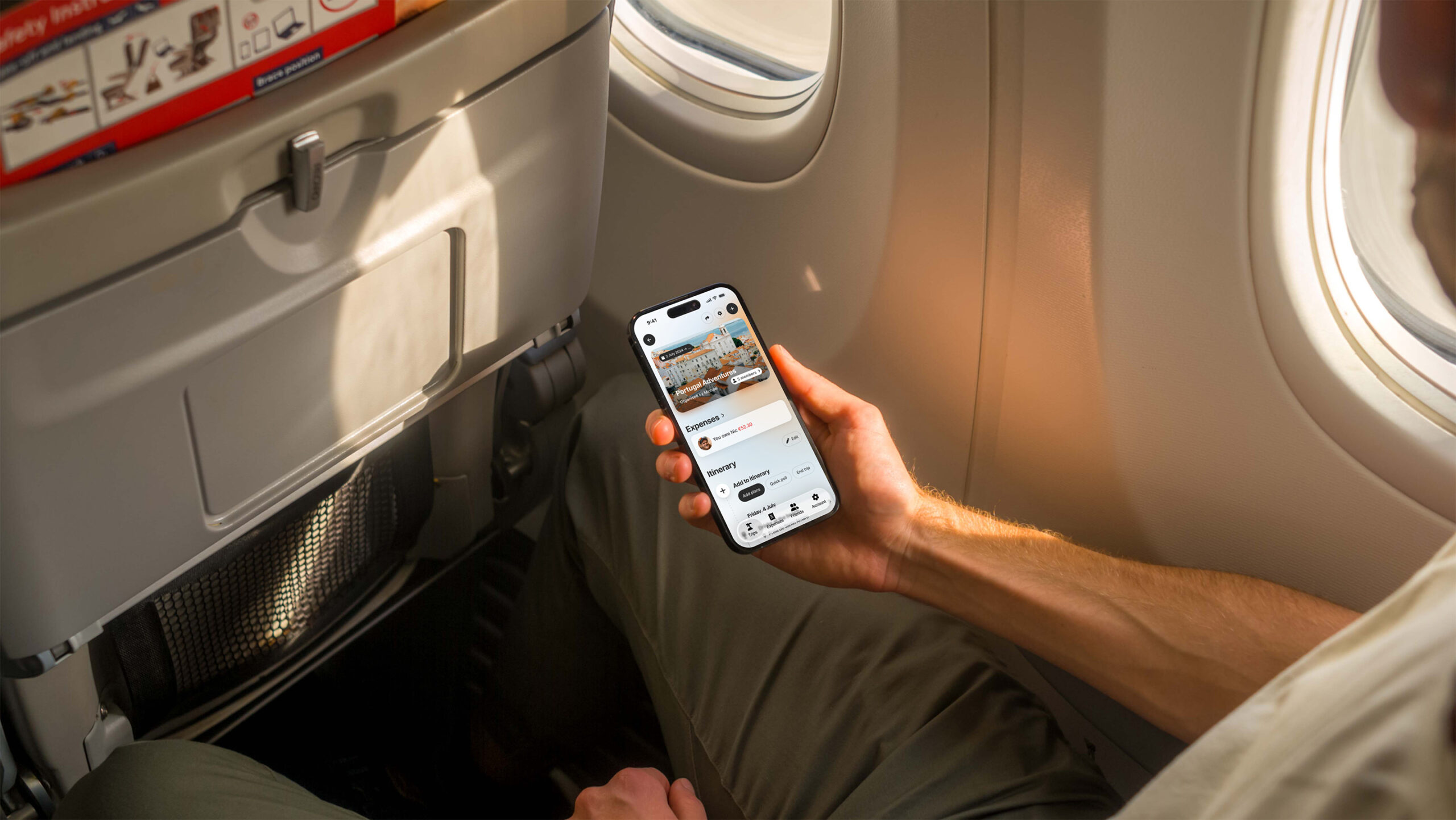
Project details
Product: Trippy
Role: UI/UX Designer
Date: 2025
Platform: iOS
Group trips currently live in group-chats.
Discussing where to go, organising what to eat, planning what to do, splitting costs, and making sure every gets reimbursed. Group trips are a highly collaborative.
There has to be a better way than a WhatsApp group-chat.
Insights
A discovery phase comprising of a number of research methods including user interviews, field research, competitor analysis, and user-journey mapping uncovered a vast range of value insights. Key takeaways included:
- Competitor analysis uncovered that platforms such as Airbnb and Splitwise promote the collaborative nature of planning and coordinating a group trip, but they’re either locked into offerings only on their own platforms or limited in their scope. Discovery platforms such as Google Maps, Foursquare, and Yelp lack the tools to collaborate effectively with other people.
- During user research, I discovered that some groups were using spreadsheets in tools such as Google Sheets to keep track of plans, expenses, and participants.
- People use a vast array of methods to plan and track parts of their trip: Flighty for flight tracking, Splid for expense tracking, Hotels.com for accommodation information, etc. and almost all trip information is communicated via group chats on platforms such as WhatsApp and Telegram
- Today, groups planning trips together are often misaligned due to the burden of tracking plans in their own apps and methods.
- Travellers expressed frustration at the lack of internet access to access information and group discussions whilst on trips, especially when abroad.
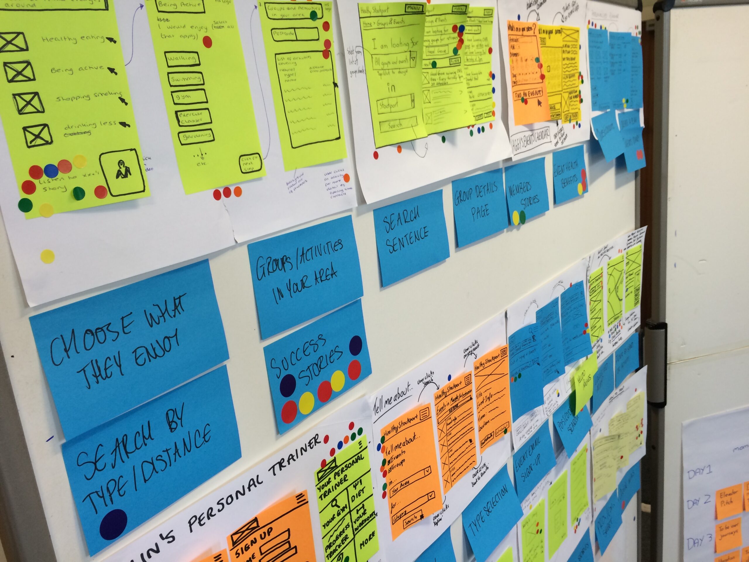
Hypothesise
- A single group trip planner that provides end-to-end / start-to-finish facilities would allow groups to coordinate more smoothly.
- Combining exploration “where should we eat?”, planning “we will go to this beach tomorrow”, and expense tracking “who had the lobster for dinner?” would enable a more collaborative group experience.
- An experience focused on an itinerary would enable more equitable trip planning, in contrast to the current solution where group-chats reward the more socially active participants.
High-level prioritised user needs
- As a group member on a trip, I want to add plans such as flights, hotels, and activities to a group trip itinerary, so that all trip participants may have access to the same information.
- As a group member who’s attempting to plan an activity that meets the needs and desires of the whole group, I want to propose a choice of options for trip participants to choose between.
- As a group member who paid the bill for an activity, I want to divide the bill between participants so that I get reimbursed the money I am owed.
UX flow and UI design
Because “information should always be at hand” was highly prioritised as a core product offering, Trippy’s first offering is a native app. Mobile access allows plans to live in peoples’ pockets, native app enabled offline access to important information.
Three high-value user flows were prioritised for the first round of ideation:
- Gathering together group members for a trip within the app
- Add an item to a trip itinerary using a collaborative method
- Submit and split a group expense
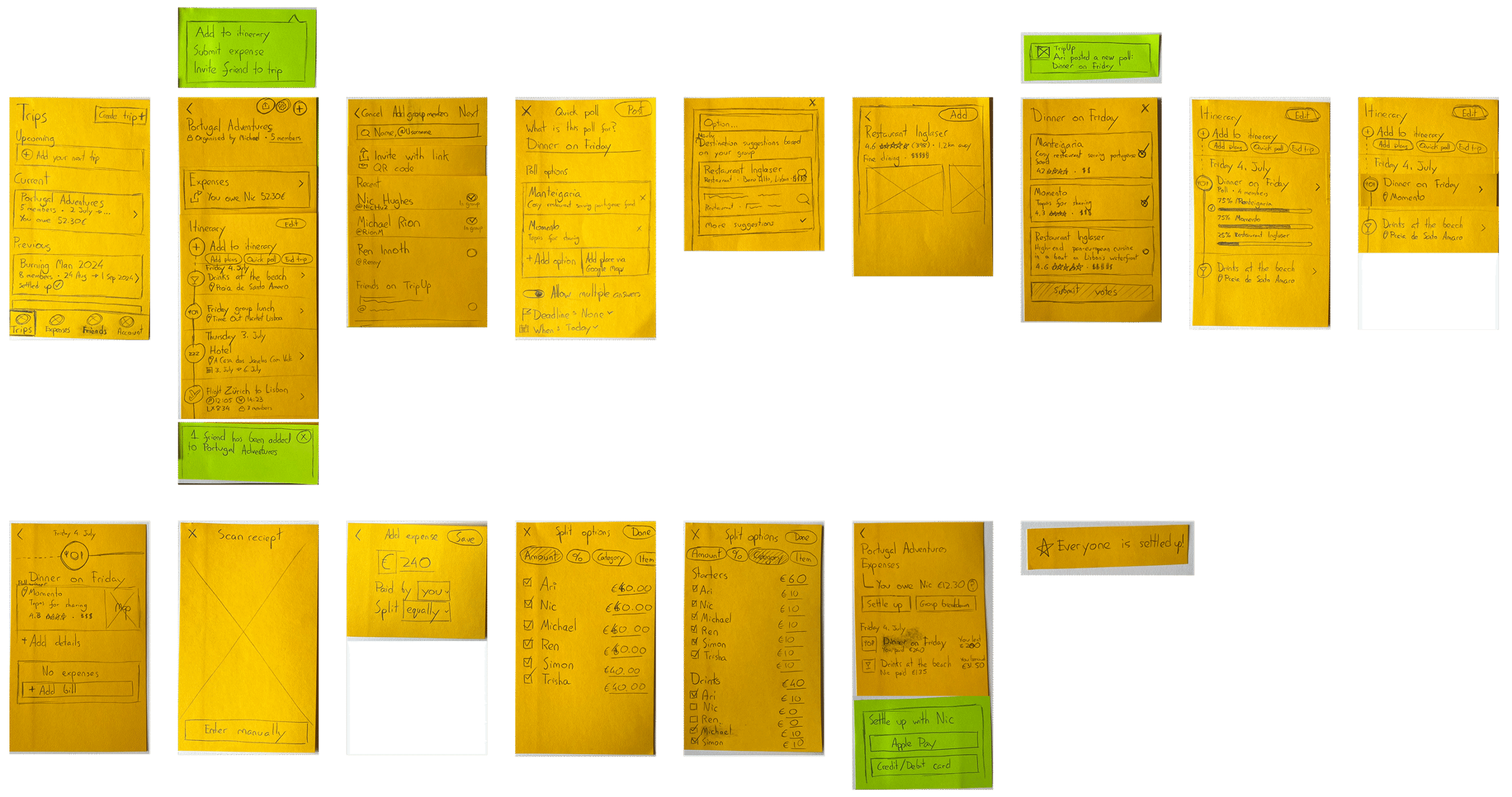
Sketches
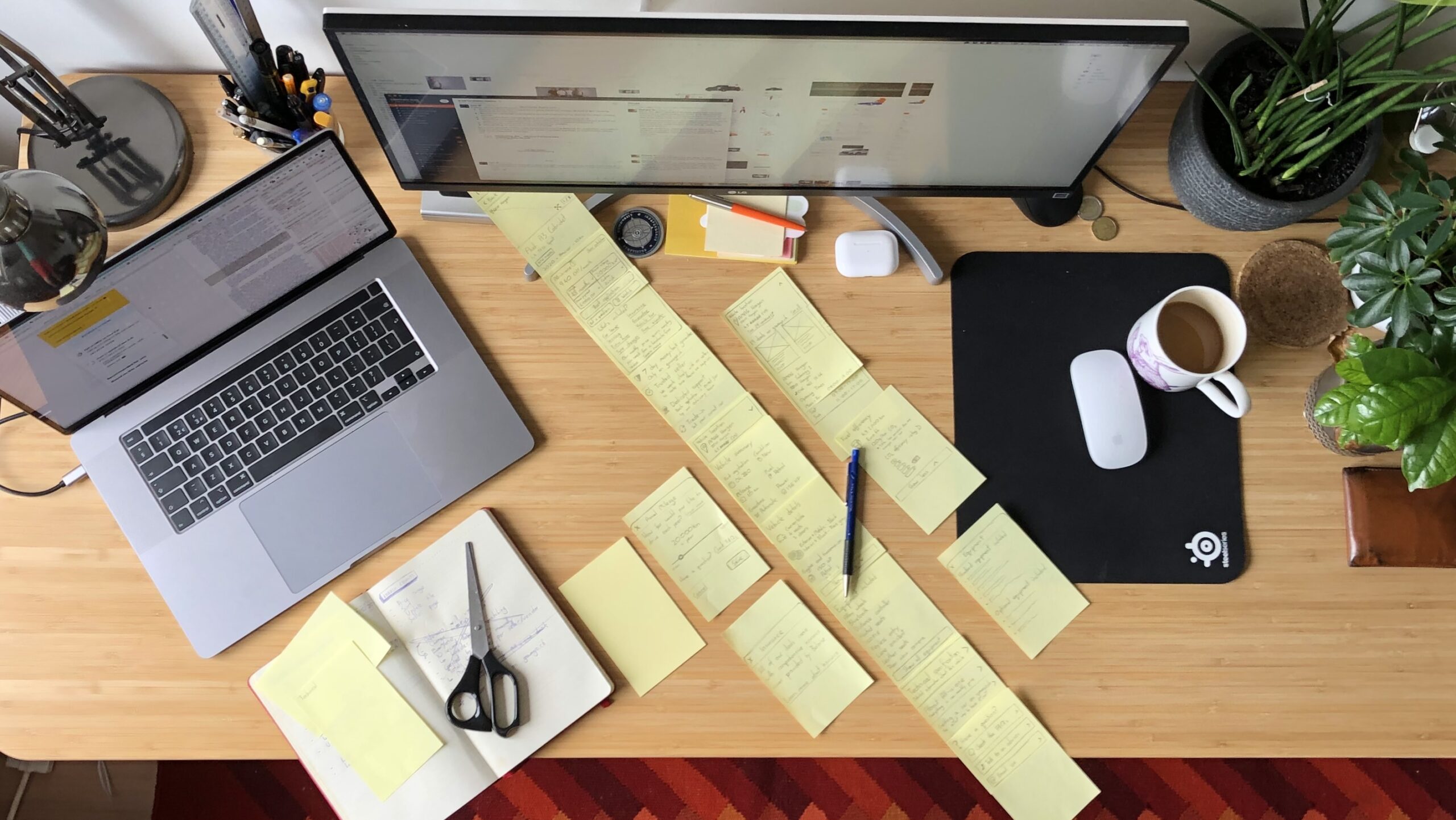
After drawing out the user flow diagrams, UI design always start with a desk full of half-scribbled interfaces –There's no faster way to ideate and gather feedback from stakeholders and team members so early in the product design process.
Sketches consider what type of information and interface elements need to be present in order to support the experience without committing to specifics.
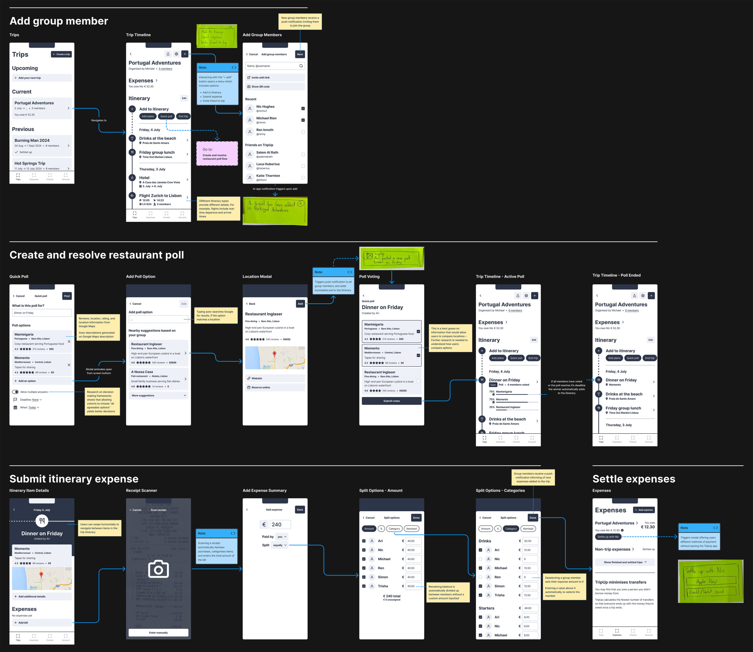
Wireflows
After gathering feedback and the sketches refined, the fidelity of design assets increases inline with the growing confidence that the solutions offered by the interface meet the needs of users.
Greater confidence I'm on the right track → More detailed designs
Wireflows and wireframes consider the structure of an interface and the flow of an experience without precisely demonstrating their final appearance. They're somewhere between an architect's sketched musings and the blueprints of a structure.
These wireflows allowed me to have better discussions with stakeholders on the position of information, the navigation structure, and the technical limitations of creating an iOS app.
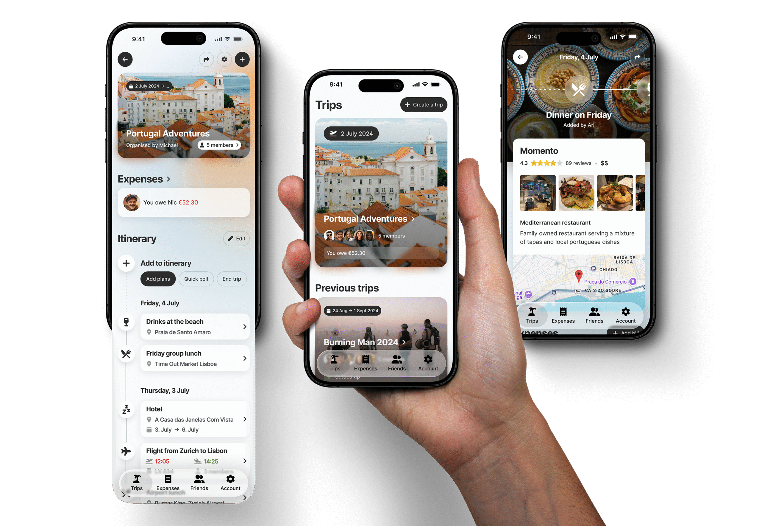
Mockups
High-fidelity mockups are the picture at the end of the Lego kit. They're as close to how the real thing will look and feel without building it for real.
These mockups, built in Figma, accurately communicate the visual style and design intentions to stakeholders, the product team, and – most importantly – the application developers.
Selected Works
Multi-touch Interactive WallNovel Technology
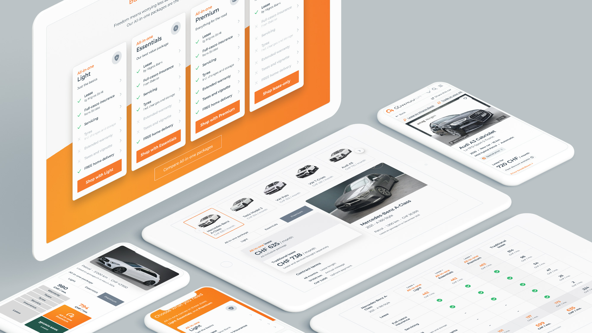
Evolving All-in-one by gowago.chUX/UI Design
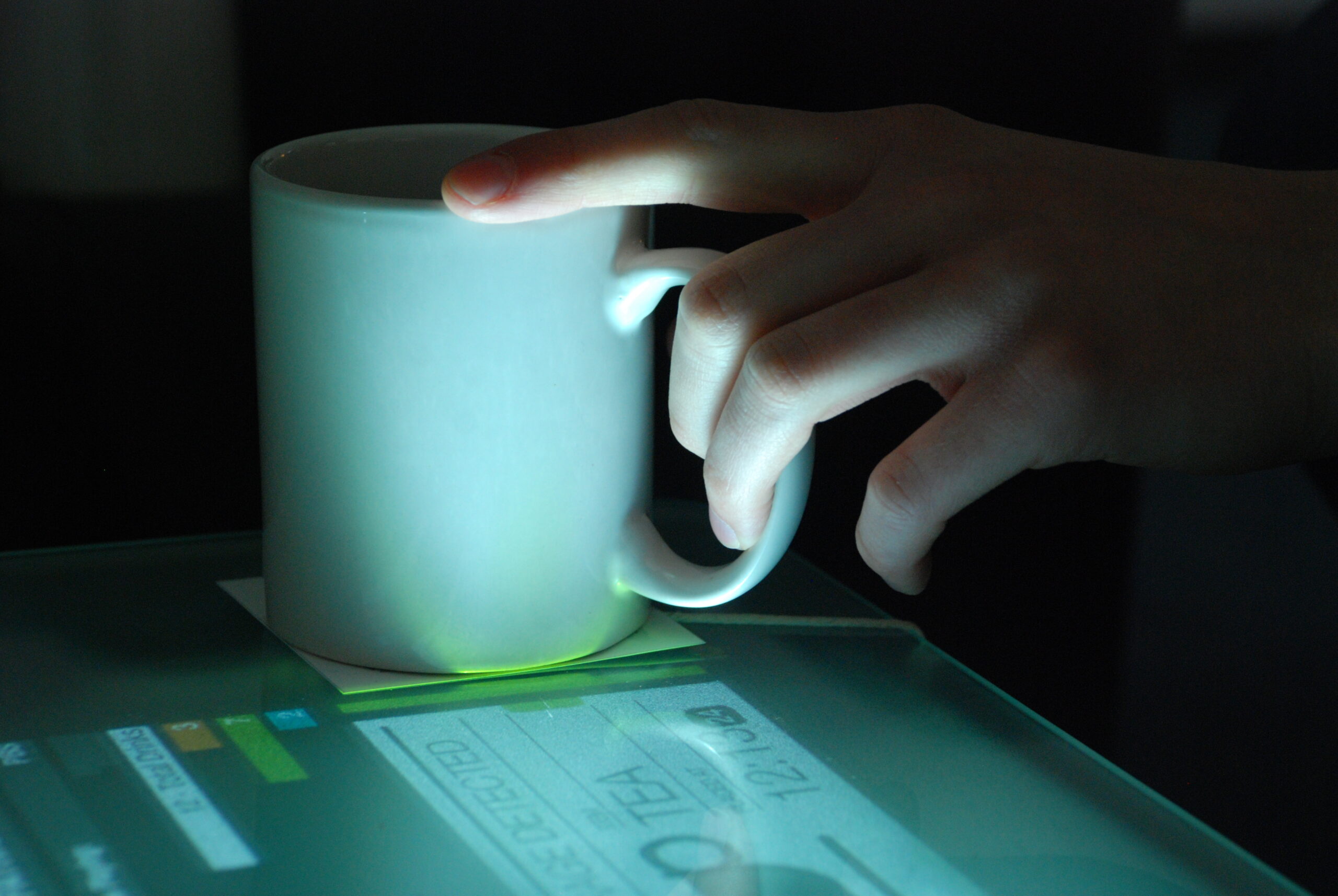
Interactive Coffee TableNovel Technology
